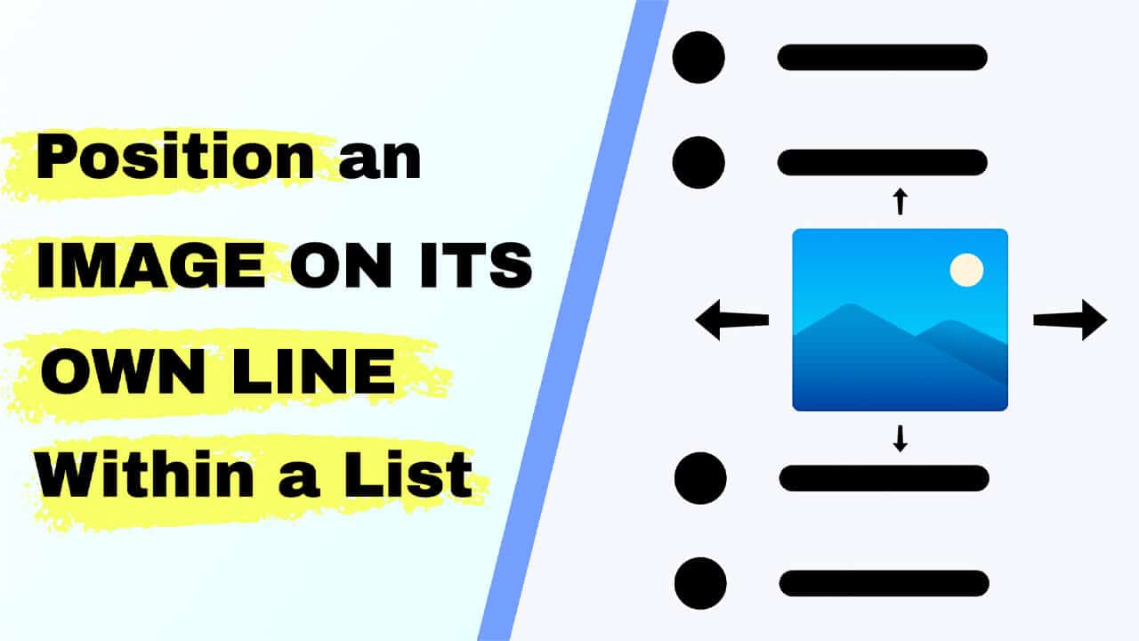
If you need to position an image on its own line within a list, this post explains a clean, reliable solution that works in WordPress and other editors.
Images inside list items are often rendered inline with text or create extra bullet items. A small CSS rule will put the image on its own centered line without breaking your list structure.
Why images end up inline inside list items
Rich text editors and HTML treat images as inline-level elements by default. When you insert an image into a list item, the editor may either:
- Insert the image as a new list item when you press Enter, or
- Keep the image in line with the surrounding text so it looks cramped and unbalanced.
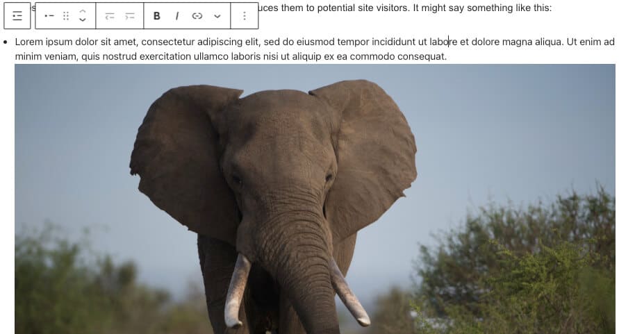
The result is a layout that is harder to read and visually messy. To fix this, convert the image into a block-level element so it starts on its own line and can be centered independently of the list text.
Quick solution: the CSS you need
The simplest way to position an image on its own line within a list is to target images inside list items and set them to display as block elements with automatic horizontal margins. Paste this into your theme’s stylesheet or the Customizer’s Additional CSS:
ul li img, ol li img { display: block; margin: 30px auto; }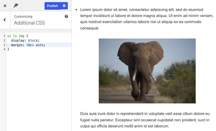
This rule does three things:
- Display: block; forces the image to occupy its own line.
- margin: 30px auto; centers the image and gives vertical breathing space (30px top and bottom).
- It targets images inside both unordered and ordered lists, so the fix is universal across list types.
Step-by-step: apply this in WordPress (Gutenberg)
- Create or edit your list item in Gutenberg and place the cursor where the image should appear.
- Choose the inline image option or insert an image block inside the list item if your editor supports it.
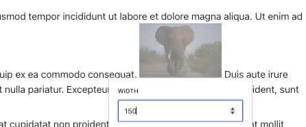
- Select an image size, or remove the fixed-width value so that CSS can control the layout.
- Open Appearance → Customize → Additional CSS and paste the CSS rule above, then save.
- Check the page and adjust the vertical margin or image width as needed.
Make it responsive and control image size
To prevent images from growing too large while keeping them centered, use a max-width rule. This keeps small images intact but prevents oversized images from overwhelming the text:
ul li img, ol li img { display: block; margin: 30px auto; max-width: 400px; width: 100%; height: auto; }
With this version, you still position the image on its own line within the list, and you also ensure it scales nicely on mobile and desktop. Adjust the max-width to taste (e.g., 300px or 600px).
Tips and best practices
- Prefer max-width over fixed width so images remain responsive.
- Keep vertical spacing modest (20–40px), so the list remains tight but readable.
- If only some lists need this behavior, scope the selector to a specific container width:
.my-list ul li img { … } - Test on multiple screen sizes after applying the CSS to ensure alignment and readability.
Conclusion
Applying a small CSS rule is the fastest way to position an image on its own line within a list while keeping your list structure intact and readable.
Whether you use Gutenberg or another editor, the same approach will center images, add space, and keep layouts consistent across devices.
