Want a lightweight way to create a Tooltip Elementor without installing extra extensions or touching complex scripts?
This guide walks through a simple method using native Elementor Pro widgets plus a few CSS snippets.
The result is a clean, reusable tooltip you can style to match any design.
Why avoid extra plugins
Installing a whole addon just for tooltips adds maintenance overhead and can bloat page load times.
Using built-in Elementor widgets keeps the site lean and gives complete control over styling and positioning with minimal CSS.
Step-by-step: build a tooltip with Elementor and CSS
- Create a container.
Add a single container that will hold both the trigger and the tooltip box. Both elements must be inside the same parent so the CSS selector can target the tooltip when the trigger is hovered.
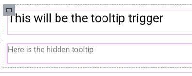
- Add two text elements.
Drag two Text Editor widgets into the container. The first will be the trigger (the visible element), and the second will be the tooltip content (the hidden box).

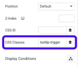
- Give each element a class.
In the Advanced tab, assign: tooltip-trigger to the trigger, and tooltip-box to the tooltip

- Style the tooltip box.
Use the editor to set background color, text color, border radius, and padding. Then, put the tooltip element’s position to Absolute so it visually floats above other content. Use the offset controls or CSS to nudge it where you want (for example top: -45px to place it above the trigger).

- Add the arrow.
Paste a small CSS snippet into the container’s Custom CSS to create an arrow pointing to the trigger. Change the color to match the tooltip background.

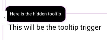
- Hide and reveal on hover.
Add CSS to hide the tooltip by default and show it when hovering over the trigger. Place this CSS in the parent container or site-level CSS so it is reusable.

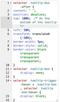
Essential CSS Snippets
selector .tooltip-box:after {
    content: " ";
    position: absolute;
    top: 100%;  /* At the bottom of the tooltip */
    left: 50%;
    transform: translateX(-50%);
    border-width: 5px;
    border-style: solid;
    border-color: black transparent transparent transparent;
}
selector .tooltip-box {
    display: none;
}
selector .tooltip-trigger:hover + .tooltip-box, selector .tooltip-box:hover {
    display: block;
}
Tips for reuse and maintenance
- Paste the CSS into a parent container or site CSS area so duplicates inherit the same rules without reapplying styles per tooltip.
- Adjust offsets for different breakpoint layouts and test on mobile — absolute positioning may need different values for responsive views.
- Change the arrow color and padding to match your design. Use selector p
{ margin: 0 }in the tooltip content to remove default paragraph spacing when needed.
Conclusion
Follow these steps to create Elementor tooltips that are fast, flexible, and easy to manage.
With minor CSS tweaks, you can match any site style and duplicate the container to reuse the pattern across pages.
