
If you want to change the image on hover to create interactive team grids, product cards, or portfolio previews, this simple Elementor technique will get you there in minutes.
In this guide, I’ll walk you through the exact structure and CSS I use to swap images on mouse hover — no complex plugins required.
Why use an image hover swap?
In one of our previous tutorials, I showed you how to show/hide a section on a button click. In this tutorial, we will continue our journey by expanding that and swapping an image on hover.

Hover image exchange is not just a stylish modern addition but also a magnet for viewers. Of course, the majority of use cases are the following:
- Team pages that show a color photo when hovering over a black-and-white portrait.
- Product thumbnails that reveal a lifestyle shot on hover.
- Portfolio grids featuring a secondary image that provides additional context.
The reason this is a bit tricky is that it is incorrectly structured, but you can apply CSS rules to create a lightweight, fast, and decluttered layout in a very short time.
What you’ll need
- Elementor (any page builder with similar widget/column control will work)
- Two images per swap (usually a default and a hover state)
- A tiny bit of custom CSS (copy/paste)
Step-by-step: How to change the image on hover
- Create the layout for your grid or card. Add a container (column) that will hold both images.
- Set the container padding to 0 so images align perfectly edge-to-edge.
- Place both image widgets inside that single container. The two images should be stacked — Set the bottom image to position: absolute so it doesn’t claim its own layout space and will sit on top of the top image. To ensure correct positioning, set the parent container to position: relative (Elementor’s container may already do this, but double-check).

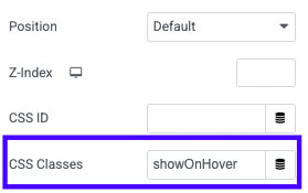
- Edit the top image (the one you want to reveal when hovered over) and assign it a CSS class, such as showOnHover. This makes the selector easy to reference.

- Open the parent container’s custom CSS area and paste the CSS shown below. This controls opacity and the hover transition.
- Publish and test on the live site — hover the image to confirm the swap works and the transition is smooth.

Custom CSS to use
selector img {
    transition: opacity 0.5s ease;
}
selector img:hover {
    opacity: 0;
}
selector img:hover .showOnHover {
    opacity: 1;
}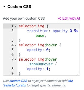
Paste this CSS into the parent element’s custom CSS field in Elementor (or into your theme CSS). The class names are easy to change — keep them consistent between the image widget and the CSS.
Pro tips and responsive considerations
- If images differ in aspect ratio, crop them consistently so they stack perfectly.
- Keep file sizes small for performance — use optimized JPEG/WEBP images.
- Test on touch devices: hover effects don’t behave the same on mobile, so consider a fallback (e.g., switch on tap or show both images stacked vertically on small screens).
- Tweak the transition duration to taste; 0.25–0.5s usually feels right.
Conclusion
This tutorial demonstrated a clean method for changing the image on hover using Elementor and a few lines of CSS.
This approach keeps your markup simple, performs well, and looks excellent in team sections, shops, and portfolios.
If you have questions or need help adapting the code for different setups, leave a comment or reach out.
