
If you want a modern, eye-catching button with a colorful edge, this guide shows how to create a gradient border in Elementor using simple CSS.
The technique works with buttons, divs, sections, or any element you choose.
Although I use Elementor in the walkthrough, the CSS approach allows you to apply the same effect in other page builders or with plain HTML.
Follow the steps below to add a polished gradient border element to your site using the Elementor style.
What you will achieve
- Create a gradient border that wraps an element without extra plugins
- Customize gradient colors using hex values
- Match rounded corners between the border and the element
- Keep the element background transparent so the border stands out
- Control hover color using Elementor style settings
Step-by-step tutorial
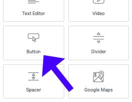
- Add the element
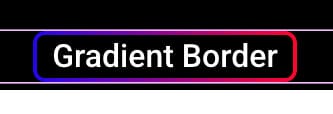
Open your page in Elementor and drag a Button (or any aspect) onto the canvas. Update the button text to something like “Gradient Border” so you can see the result clearly.

- Prepare the layout
Center the button, and increase the text size from the Style tab so the border is easier to see. Switch the parent section background to a darker color, such as black, so the gradient edge stands out.
- Paste the CSS
Navigate to the element’s Advanced tab and paste the CSS into the Custom CSS field. The CSS creates a rectangle overlay that sits on top of the component, displaying the gradient border. Because it is an overlay, you can reuse the same code for buttons, divs, or sections.

- Customize gradient colors
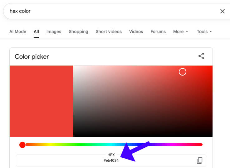
Within the CSS, you will see two hex color values for the gradient. Replace those with any hex codes you like. A quick way to pick hex codes is to search “hex color” in Google and use the color picker. After replacing the hex value, you will see the new gradient immediately.

- Enable rounded corners (optional)
If you want rounded corners, you will find a rule in the CSS you can uncomment to set the border radius. Try 15px as a starting point.
- Match the button radius
When the overlay has rounded corners, adjust the button or element border radius in Elementor to the same value so both layers align perfectly. This maintains the crisp and consistent gradient border.
- Make the element background transparent
If you want only the border to be visible, set the element’s background color opacity to zero from the Style tab. The gradient border remains visible while the component itself appears transparent.

- Set Hover Color
Use Elementor’s hover settings to select a hover background color for the button. The gradient border remains in place while the inner button color changes on hover, giving a nice interactive effect.
- Publish
When everything looks right, click Publish, and your gradient border Elementor button is live.
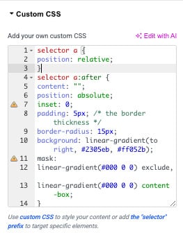
How the CSS works (brief)
selector a {
    position: relative;
}
selector a:after {
    content: "";
    position: absolute;
    inset: 0;
    padding: 5px; /* the border thickness */
    border-radius: 15px;
    background: linear-gradient(to right, #2305eb, #ff052b);
    mask:
    linear-gradient(#000 0 0) exclude,
    linear-gradient(#000 0 0) content-box;
}
The CSS creates a positioned pseudo-element or an overlay rectangle that sits above the element and uses a background-image gradient.
The overlay shows the gradient edge while allowing the underlying element to display its content.
By controlling the overlay size, border radius, and background transparency, you get a clean gradient border effect that is easy to customize.
Tips and customization ideas
- Use complementary hex colors for subtle transitions or bold, contrasting colors for stronger emphasis.
- Adjust the overlay thickness in the CSS to achieve a thinner or thicker border.
- Combine the gradient border with a subtle box-shadow to add depth.
- Test the effect on different background colors to ensure contrast and accessibility.
- Reuse the same CSS on other elements to create a consistent design system across your site.
Frequently asked questions
Yes. The CSS overlay works on any element you target, including divs, sections, and cards. Paste the same CSS into the element’s Custom CSS and adjust sizes and radii as needed.
Elementor Pro provides a Custom CSS field for each widget, which is convenient. If you don’t have Pro, you can add the CSS to your theme’s stylesheet or via a custom CSS plugin and target the element by class or ID.
Open the CSS and replace the two hex color values used in the gradient with your chosen hex codes. You can pick hex codes using any color picker or by searching “hex color” in Google.
Set the same border-radius value on both the overlay (in the CSS) and the element itself in Elementor. Use the same pixel amount, for example, 15px, so the curves align perfectly.
No. The clickable area remains the button itself. The overlay is positioned to wrap the element visually, but you can control pointer events in the CSS if you need the overlay to be non-interactive.
Related tutorials
- How to Change Mouse Cursor in WordPress and Elementor Easily
- How to Show / Hide a Section On Button Click in Elementor and WordPress
- How to Change Image on Hover in Elementor (Easy Step-by-Step)
Consclusion
Creating a gradient border in Elementor is a simple way to add personality to your call-to-action elements.
With a small amount of CSS and a few adjustments in Elementor, you can design buttons and components that stand out.
Try different color combinations and radii until you find a style that matches your site.
